I tried Vibe Coding for 4 hours, this is how it went
What is Vibe Coding?
Vibe Coding, as the name suggests. Takes a more holistic look at software development, where specialists are not required to dig deep into a skill or tech stack in order to perform their work and have a final product. As someone who have worked more than half of his career switching between BA, PM, UX and Dev roles, it’s for me the sweet spot where design, development, and product thinking merge by using AI to speed up and cover for more fine-grained skills, allowing people to create with flow rather than friction.
Instead of having to endure endless courses online to have deep expert knowledge of every role you’re gonna perform during the development of an application, vibe coding brings:
- LLM-powered Rapid brainstorming and app concept idealisation
- Automatic UX Designing which enables quicker Prototyping
- AI-assisted code generation based on design files
- Manual adjustments on the codebase
My case study: Developing an astrogoly app in react-native for 4 hours
Quick disclaimer: I have already worked on the creation of multiple apps from discovery until first launch and late support, so for me the steps to create such an app were very clear. The speed can always vary depending on the people trying this out and how much effort you want to put on a particular step.
I wanted to use my prior knowledge on the lifecycle for an app development to be conceived until its’ release, leverage it with Vibe Coding, in order to have a better perspective on its’ potential. As I was doing this on my free time on a Sunday, I didn’t want to spend more than 4 hours, so I have limited my time to this slot and to see how far I would’ve gotten with it. This is how it went:
Step 1: Brainstorming and concept idealisation (10 minutes)
I have quickly chatted with (OpenAI’s ChatGPT)[https://chatgpt.com/] per voice and explained that I wanted to create an astrology app that was simple and intuitive to look and interact with, where an user could pick their zodiac sign and see quickly what the app had to tell them about it.
That sounds like a fun project! For an astrology app that's simple and intuitive, here are a few design tips:
1. Clean Layout: Use a clean, minimalistic design with plenty of white space. This will make the app feel welcoming and easy to navigate.
2. Zodiac Selection: Provide a simple way for users to select their zodiac sign, like a dropdown menu or a set of icons representing each sign.
3. Personalized Content: Once a sign is selected, display the horoscope clearly, with sections for daily, weekly, or monthly predictions.
4. Visual Aesthetics: Choose a color palette that reflects the mystical and celestial nature of astrology. Soft blues, purples, and golds can be great choices.
5. User-Friendly Navigation: Keep navigation simple, with a clear back button and easily accessible settings.
Do you have any specific features or elements in mind that you want to include?
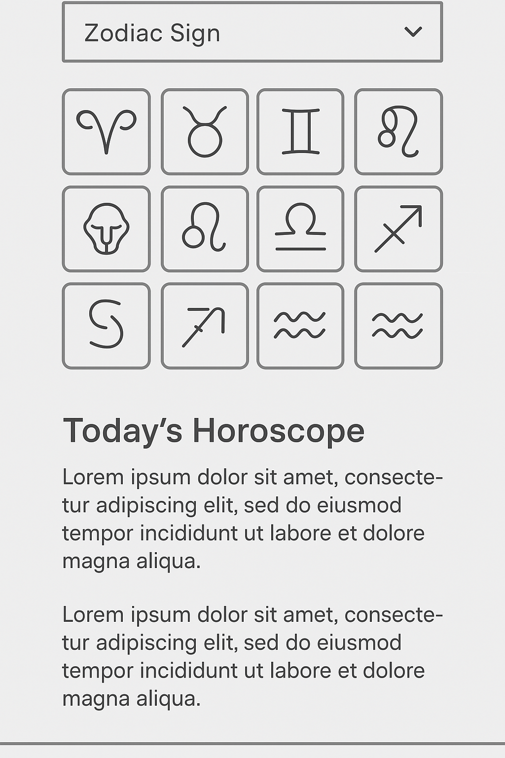
Great start for a brainstorming, I already have some UX defaults I should strive for, coloring suggestions, layout suggestions and even feature suggestions that might be interesting to the user. For me the idea of having a grid for the zodiac signs sounded pretty good, so I expressed that in my response and asked it to generate a wireframe for the UI for me.
This was the final result of our interaction, not too bad, I would’ve removed the top dropdown element, but as I wanted to design it myself, I can easily just ignore that it’s there. As I also wanted to have the astrological in a separate page, I also would prefer to have the grid as 3x4 instead of 4x3 and the astrological text in a separate page.
Step 2: Designing in Figma (2 Hours)
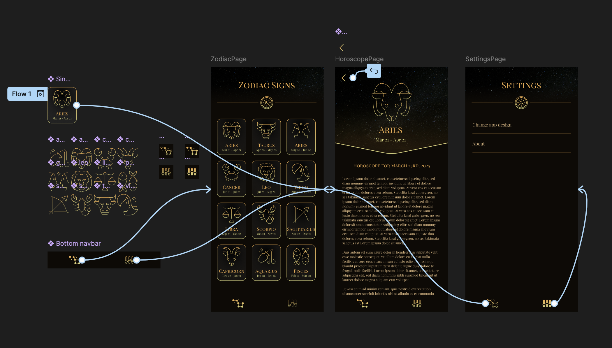
With the wireframe on my hand, I have started designing views on Figma. I took extra time here to make sure that components were being properly prototyped, and that the design actually looked good. I’m sure that this step could’ve been made quicker with another AI-powered tool or feature, but I wanted to make sure the design had a very good look and feel, as well as proper prototyping. (also it was super fun to reconnect with my designing skills, so I got a bit carried away here).
During this step I have done a few prompts on ChatGPT again to ask for its’ opinion on the color pallete and the overall “feel” of the design, it sounded very positive and it suggested me fun changes to achieve a cooler design. It was a bit like having a UX-sparring buddy.
This was the end result:

Step 3: Generating the Code with Vercel’s AI (20 minutes)
Once I had the Figma file ready I went to (Vercel’s v0)[https://v0.dev/] to generate a first code structure. I wanted to give it a very simple explanation only to tell it the tech stack, just to test how smart It would actually be. This was the prompt:
Please recreate the UI shown in the attached Figma URL as accurately as possible.

To implement it: use react-native, expo and typescript.
The result was a codebase with 12 files, I wasn’t able to deploy it directly to a GitHub repo, so I needed to copy-paste them manually into a new project, that process took me a bit of more time than it would’ve taken someone with a paid plan. This allowed me also to have a brief look at the files I was copying, and so far the quality was pretty good, the code was readable, the Figma prototypes were correctly identified as reusable components and the actions to navigate to another screen was also implemented.
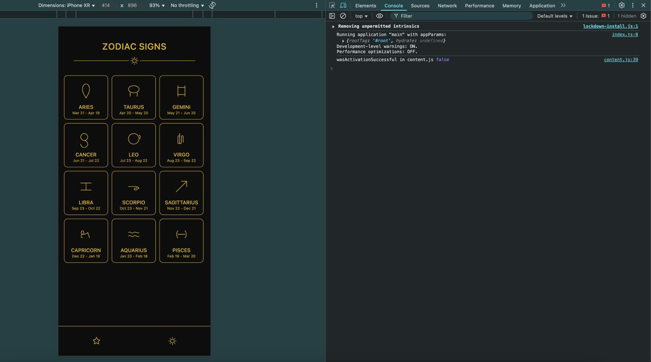
This was the first version of the app after I installed all dependencies and ran npm run web:

The icon design was pretty different from the design, also the bottom navigation bar was not sticking to the bottom of the screen once a different one was opened. Which is ok, I wasn’t too aware that on figma it was possible to anchor elements to the bottom, so probably v0 didn’t understand that it was a bottom navbar by itself.
The Vibe Coder here could definitely write follow-up queries to the chat and ask it to fix its’ mistakes, but I was too eager to dive a bit deeper into the code and see what was happening, I gues old habits die hard.
Which brings us to the last step.
Step 4: Manual fixes (1 Hour and 20 minutes)
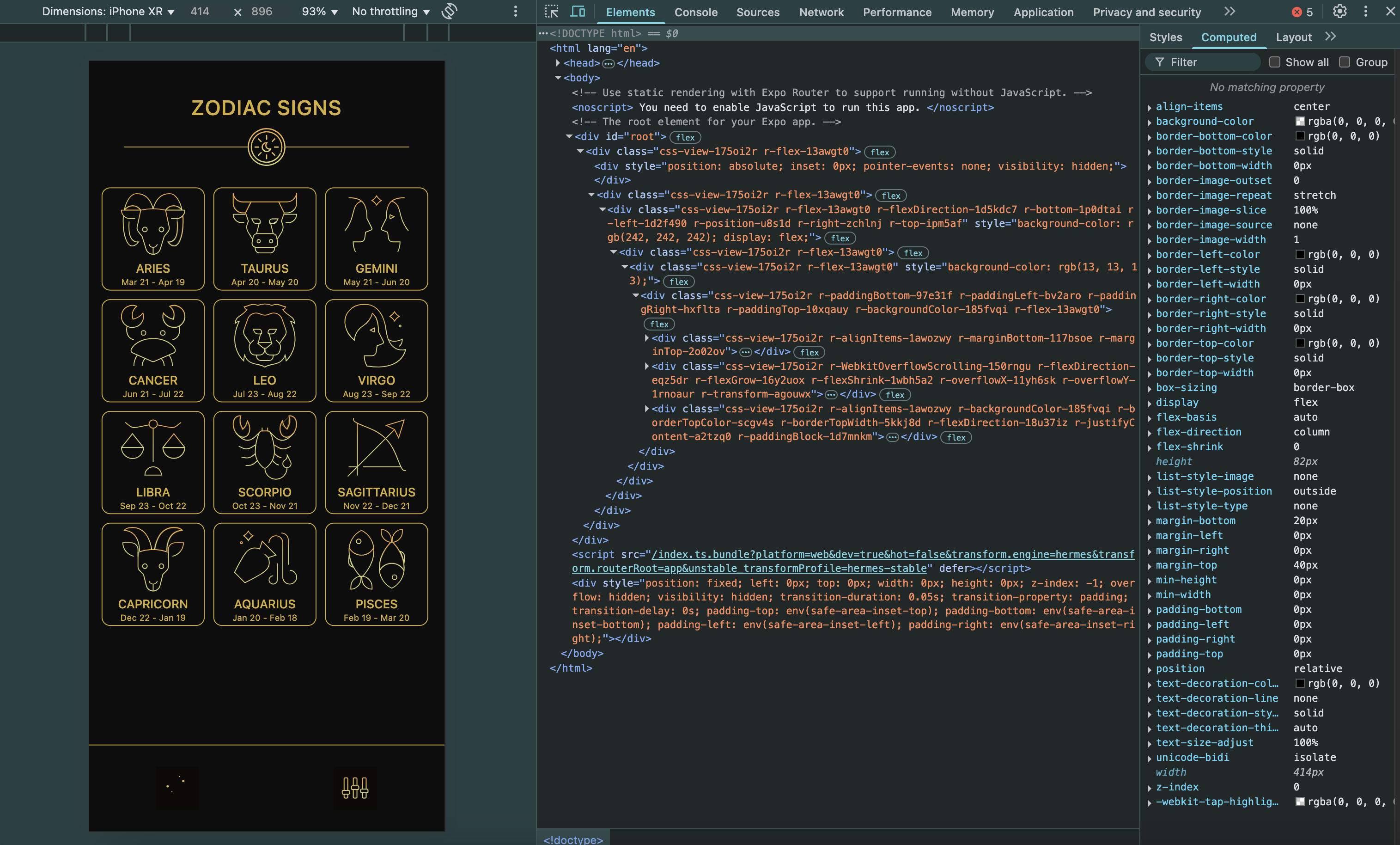
Now it was time to interact with (GitHub’s co-pilot)[https://github.com/features/copilot] and try to fix and address some of the contrasts that the app had form the design. This process required some manual SVG icon imports and recoloring.
Once my 4-hour timer went off, this was the current state of my astrology app:

In summary: A game changer for innovators
After this quick experiment I realised that Vibe Coding and the usage of AI tools in software development offer us a huge opportunity to become more autonomous in the market and to launch new products with way less effort, knowledge and budget. A process that would normally take me days (if not weeks) and lots of prior knowledge in different areas to finish, was covered in just a few hours.
This encourages me to try this out more often, it makes me also reflect if I need to be really working 5x per week from 9-5 in order to develop a product for others, where I could instead be creating things that I’m more interested in on my own.
Finishing thoughts: the potential risks ahead
I wanted to finish this blog post on a positive note, but after seeing what happened to social networks and other content creation and news industries after heavy adoption of AI tools and making content creation more accessible to all, I need to raise this concern here as a final thought for reflection:
Making tools more accessible to people in other to empower them to create and have more self-determination is always the right thing to do, on the other hand reckless and heavy adoption was one of the biggest causes for the devaluation of artists, their career and their art thorugh spam of low quality, uncreative and AI-automated content (which ironically was fed content from the very artists damaged without their consent), other issues such as the heavy campaining of fake news by bots and automatically generated content are also extremely concerning.
It all looks very similar to the Dead Internet Theory and I hope that this doesn’t happen to the creation of apps as well. In the startup environment we used to tell young aspiring developers who wanted to publish their own app the following: “Just because you could publish your own app, doesn’t mean you should.”, the intent of this sentence was not to discourage people to publish their own app, but to focus harder on the business acumen, what would make their app stand out and be unique compared to the other apps that are already out there serving the same target audience, also to look for cheaper and simpler alternatives to solve the issues of the target audience they’re looking at.
App development is of course a completely different scope compared to content creation and it requires a much different set of commitment from the creator to its’ creation, such as compliance with data policies and infoSec, following policies from each store they’ll publish the app on, app performance and responding to direct user feedback. If app publishers become reckless on these sensible practices and are not taking full ownership of their product, this could be a huge risk to their users.
Let’s see how this will go, maybe I’ll reopen this topic on another blog post.
